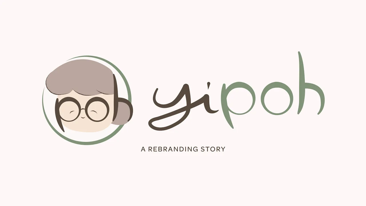

YI POH
Full Rebranding
Contributions
Advertising Strategy
Logo Design
Video Production
3D Rendering
(not officially affiliated with the brand)
Consumers continue to grow more and more attached to minimalist design, and brands are always evolving to keep up. The big question then arises: how can a brand rooted in culture and heritage adapt?
Yi Poh was born from our integration of cultural heritage into modern product packaging design. Our aim was to renew a brand into something that resonates with modern tastes while preserving the symbolism and intricacies of traditional cultural design.
Bite-A-Snack—an online store based in Ipoh, Malaysia that sells traditional snacks—was our brand chosen for its cultural roots and lack of distinct branding.


LOGO
Why Yi Poh?
“Yi Poh" means “grand aunt" in Chinese, which we use to symbolize the heritage and traditional roots of the brand. Much like grandma's traditional snacks and cookies, we want to bring in a sense of nostalgia and familiarity to the brand's identity.
The logo aptly depicts a warm, smiling grandma using the word “poh" from the brand's name. Inspired by traditional Chinese calligraphy, the flowing strokes lend a humble, handwritten feel.

PACKAGING
Inspired by traditional Chinese lanterns
The overall packaging concept is shaped like a lantern as a representation of Chinese heritage and traditions. This allows the packaging to double as a decorative piece. While mostly associated as being a festive decoration, these lanterns are used by Chinese households and establishments around the world all the time.
As for the visual design, we chose to go with a motif/patterned design comprised of grids and symbols that represent our chosen product (Kacang Tumbuk) and Chinese culture. These motifs are further used in our video advertisement.


